Have you ever walked into a room and immediately felt calm? Or perhaps you’ve visited a website and felt an instant urge to click “Buy Now” without really knowing why?
It wasn’t magic. It was colorful.
Color psychology for web design is the study of how different colors change the way people feel and act when they visit a website. In simple terms, it is using specific colors to tell your visitors what to think about your business before they even read a single word. By choosing the right colors, you can make people trust you, feel excited, or stay on your page longer.
What is Color Psychology in Web Design?
Imagine you are opening a new coffee shop. If you paint the walls bright, neon purple, people might feel confused or rushed. But if you use warm browns and soft greens, they feel cozy and ready to relax.
Web design works the exact same way.
Color psychology is the “secret language” of your website. It is the practice of using colors to influence human behavior. When you pick a color for your buttons, background, or logo, you are sending a silent message to your customer’s brain.
Why it Matters
Most people form an opinion about a website in less than a second. Color is the first thing they see. If your colors don’t match your message, people will leave. If they do match, you’ve just made a friend and a potential customer.
Why Colors Matter for Your Website
Colors are more than just “pretty decorations.” They are powerful tools that help your business grow. Here is why they are so important:
- First Impressions: You never get a second chance to make a first impression. Your website’s color scheme tells visitors if you are a serious law firm, a fun toy store, or a high-tech software company.
- Building Emotions and Trust: Would you trust a bank with a bright pink and orange website? Probably not. We expect banks to use blues or greys because those colors feel “safe.” Using the right colors makes your brand feel honest and professional.
- Boosting Conversions: A “conversion” is just a fancy word for getting someone to do what you want like signing up for a newsletter or buying a product. Changing the color of a “Buy Now” button can actually change how many people click it!
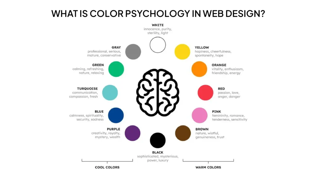
Meaning of Popular Colors in Web Design
Every color tells a different story. Let’s look at the most popular ones used on the web:
Red: The Color of Energy
Red is loud and exciting. It grabs attention fast.
- The Feeling: Hunger, excitement, urgency, and passion.
- Best For: Clearance sales or food websites.
- Real-World Example: Netflix and Coca-Cola use red to get you excited and ready to watch or drink.
Blue: The Color of Trust
Blue is the most popular color for websites because almost everyone likes it.
- The Feeling: Calm, safety, honesty, and intelligence.
- Best For: Banks, tech companies, and healthcare.
- Real-World Example: Facebook and PayPal use blue so you feel safe sharing your info and money with them.
Yellow: The Color of Happiness
Yellow is like a ray of sunshine. It’s hard to be sad when looking at yellow!
- The Feeling: Joy, optimism, and warmth.
- Best For: Creative brands or businesses that want to feel friendly.
- Real-World Example: IKEA and Snapchat use yellow to show they are fun and accessible.
Green: The Color of Nature
Green is the easiest color for the human eye to process.
- The Feeling: Growth, health, peace, and wealth.
- Best For: Science, outdoor brands, and healthy food.
- Real-World Example: Whole Foods and Starbucks use green to show they are fresh and natural.
Black: The Color of Luxury
Black is sleek and powerful. It’s for brands that want to look expensive.
- The Feeling: Power, elegance, and mystery.
- Best For: Luxury cars, high-end fashion, and tech.
- Real-World Example: Apple and Nike use black to look modern and high-quality.
White: The Color of Cleanliness
White gives your website “breathing room.”
- The Feeling: Clean, simple, and organized.
- Best For: Modern websites that don’t want to look cluttered.
- Real-World Example: Google uses a white background so you can focus exactly on what you are searching for.
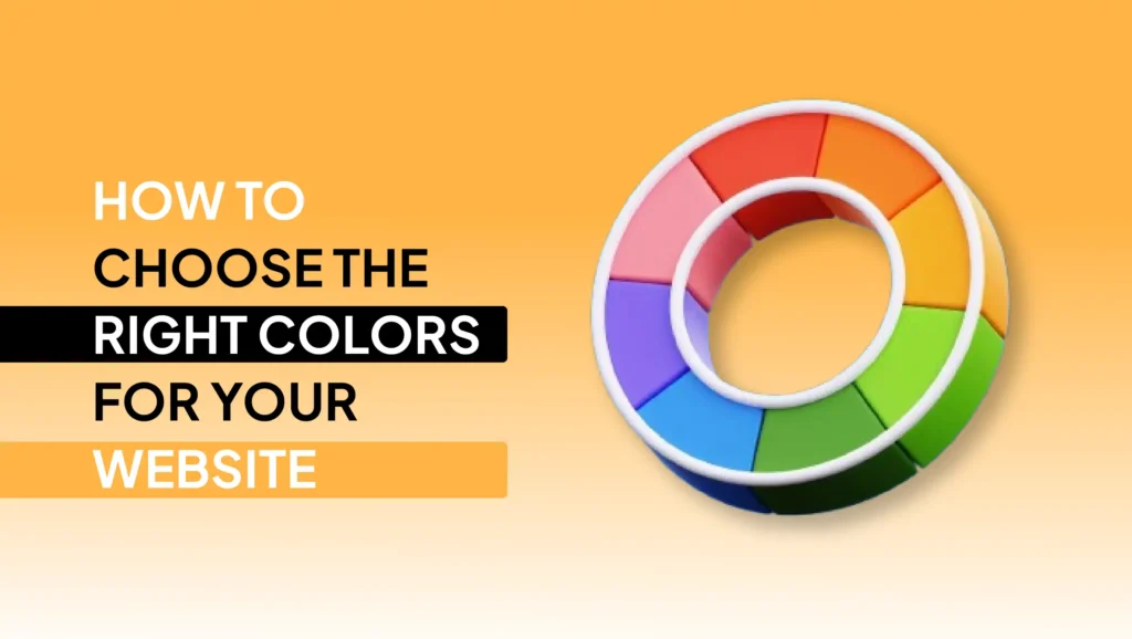
How to Choose the Right Colors for Your Website
Choosing colors shouldn’t be based on your favorite color. It should be based on what works for your business.
Think About Your Audience
Who are you talking to? If you are selling toys to kids, use bright, primary colors. If you are selling retirement plans to seniors, use soft, calming colors.
Think About Your Brand
What is your brand’s “personality”? Are you a “rebel” brand like a motorcycle shop? Use dark, edgy colors. Are you a “nurturing” brand like a daycare? Use soft pastels.
Think About Your Goals
What do you want people to do? If you want them to click a button, make that button a color that stands out from the rest of the page.
Common Mistakes to Avoid
Even the best business owners make these mistakes. Here is what to watch out for:
- Using Too Many Colors: If your site looks like a rainbow exploded, people won’t know where to look. Stick to 2 or 3 main colors.
- Poor Contrast: Have you ever tried to read light grey text on a white background? It’s impossible! Make sure your text is easy to read against the background.
- Ignoring Accessibility: Some people are colorblind. Don’t rely only on color to show something. For example, use a red “X” and a text label that says “Error.”
Simple Tips to Use Color Psychology Like a Pro
- The 60-30-10 Rule: Use your main color for 60% of the site, a secondary color for 30%, and a bright “accent” color for the final 10% (like your buttons).
- Use White Space: Don’t be afraid of empty space. It makes your colors look better and your site easier to read.
- Test Your Buttons: Try a green button for a week, then a red one. See which one your customers like more!
Why It Matters for Your Business
At the end of the day, your website is your 24/7 salesperson. If your salesperson showed up to a meeting wearing mismatched clothes and looking messy, you wouldn’t close the deal.
Color psychology for web design ensures your “online salesperson” looks professional, trustworthy, and ready to help. When your colors match your message, your customers feel comfortable. When they feel comfortable, they buy.
At NoorSoft Tech, we don’t just pick colors because they look pretty. We use science and data to build websites that connect with your customers’ hearts and minds.
FAQs
What is color psychology in web design?
It is the study of how colors on a website affect a visitor’s mood, feelings, and actions. It helps businesses choose colors that make people trust them or buy from them.
Which color is best for websites?
There isn’t one “best” color, but Blue is the most widely used because it represents trust and safety. However, the best color for your site depends on your specific audience and goals.
How do colors affect users?
Colors trigger emotions in the brain. For example, red can make a user feel a sense of urgency (great for sales), while green can make them feel relaxed and healthy.
What colors increase conversions?
High-contrast colors usually work best for buttons. If your site is mostly blue, an orange or red button will stand out and get more clicks because it draws the eye immediately.
Ready to Give Your Website a Makeover?
Choosing the perfect colors can feel overwhelming, but you don’t have to do it alone. Whether you’re starting a brand-new business in Frisco or looking to refresh your current site, NoorSoft Tech is here to help.
We specialize in creating beautiful, high-performing websites that use the power of color psychology to turn visitors into loyal customers.
Let’s build something colorful together.