
Have you ever tried to open a website on your phone, only to find the text is too small to read? Or maybe the buttons were so small you couldn’t click them? Most of us just leave those sites and never go back.
How modern web design improves mobile user experience is by making websites fast, easy to read, and simple to use on any smartphone. Modern design ensures that a website automatically adjusts its layout to fit your screen perfectly. This means no more zooming in to read or struggling to find the “Contact” button. By focusing on mobile users first, businesses create a smooth journey that keeps people happy and helps them find what they need in seconds.
What is Mobile User Experience?
Mobile User Experience (or Mobile UX) is simply how a person feels when they use your website on their phone.
If the site is fast and easy to navigate, the UX is good. If the site is slow, cluttered, or hard to use with one hand, the UX is bad. Today, your website is often the first “handshake” you have with a customer. If that handshake feels clunky because of a bad mobile layout, you might lose that customer forever.
When we talk about UX, we are talking about the “vibe” of your site. Does it feel helpful? Does it feel modern? Or does it feel like a chore to use? In a world where everyone is in a hurry, a good experience is the difference between a sale and a bounce.
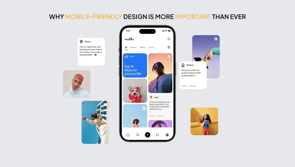
Why Mobile-Friendly Design is More Important Than Ever
Most people in the US now browse the web using their phones rather than a computer. Whether someone is waiting for coffee or sitting on the couch, they are using their smartphones to find local businesses.
If your website doesn’t work well on a phone, you are essentially closing your doors to more than half of your potential customers. People today expect things to work instantly. If a site takes more than a few seconds to load or looks “broken” on a screen, they will move to a competitor’s site that works better.
Think about your own habits. When you search for “plumber near me” or “best pizza,” you are likely holding your phone. If the first site you click on is a mess, you don’t stick around to solve the puzzle, you just go to the next result. Businesses can’t afford to be the “puzzle” that users give up on.
How Modern Web Design Improves Mobile User Experience
Modern design isn’t just about looking pretty. It is about working well. Here is how modern techniques make the mobile experience better:
1. Responsive Design (Fits All Screens)
In the past, businesses had to build two separate websites: one for computers and one for phones. Modern design uses “Responsive Design.” This means your website is like water; it flows to fit the shape of whatever “container” it is in, whether that is a giant monitor or a small iPhone.
This technology detects the screen size of the visitor automatically. It reshuffles the columns and resizes the images so the user doesn’t have to think about it. It’s a seamless transition that makes your brand look high-tech and professional.
2. Faster Loading Speed
Mobile users are often on the go. They might not have a fast Wi-Fi connection. Modern web design uses clean code and smaller image files to make sure the page pops up instantly. A fast site makes users feel like your business is professional and reliable.
Every extra second a user waits for a page to load, the chance of them leaving goes up. Modern design uses “lazy loading,” which means the site only loads the parts of the page you are actually looking at. This saves data and time for the user.
3. Easy Navigation (Thumb-Friendly Design)
Think about how you hold your phone. You mostly use your thumb! Modern design puts the most important buttons where your thumb can easily reach them. This is often called the “Thumb Zone.” We avoid putting tiny links in the corners where they are hard to tap.
We also use “Hamburger Menus” those three little lines you see at the top of a screen. This keeps the menu hidden until the user needs it, which saves valuable screen space for your main message.
4. Clean and Simple Layouts
On a small screen, less is more. Modern design removes the “fluff.” It uses plenty of white space so the user doesn’t feel overwhelmed. By keeping things simple, you help the user focus on what matters: your products or services.
A cluttered site on a phone is like a messy desk. It’s hard to find the pen you need. Modern design clears the desk so the customer can find the “Buy” or “Call” button immediately.
5. Readable Text Without Zooming
No one likes “pinch-to-zoom.” Modern design uses font sizes that are large enough to read at arm’s length. We also use plenty of space between lines of text so the words don’t look like a giant, scary wall of blurry ink.
We also choose fonts that are easy to read on back-lit screens. Thin, fancy fonts might look nice on paper, but they can disappear on a bright phone screen outside. Modern design picks fonts that stay sharp and clear.
6. Mobile-Optimized Images
High-quality photos are great, but they can be heavy. Modern design uses “smart” images that change size based on the device. This keeps the site looking sharp without slowing down the phone.
Instead of downloading a giant photo meant for a TV screen, a mobile-optimized site will send a smaller version of that same photo to the phone. The user sees a crisp image, but their phone doesn’t have to work as hard to show it.
Real-Life Examples of Good vs. Bad Mobile Design
To see these rules in action, it helps to compare a site that works with one that doesn’t. Most mobile users decide whether to stay or leave in less than five seconds. Here is a quick breakdown of how small design choices can make or break your customer’s experience.
The “Bad” Experience:
Imagine you are hungry and looking for a local cafe. You open their site, but you have to scroll left and right just to see the menu. You try to click “Call Now,” but the button is so small you accidentally click an ad instead. You get frustrated and leave. That is a bad mobile UX.
Other bad examples include “ghost buttons” that you can’t see against the background, or forms with 15 different boxes to fill out using a tiny mobile keyboard. These things make users want to throw away their phones.
The “Good” Experience:
You open another cafe’s site. The menu is right there in big, clear text. There is a large “Order Online” button right at the bottom where your thumb sits. The site loads in one second. You place your order and feel great about that business. That is how modern web design improves mobile user experience.
Good design feels invisible. You don’t notice it; you just notice that you got what you wanted without any stress.
Benefits for Businesses
When you invest in a modern, mobile-first website, your business wins in three big ways:
- Better User Engagement: People stay on your site longer because it is a joy to use. They browse more pages and learn more about you.
- Higher Conversions: When it is easy to buy or call, more people actually do it. If the checkout process is one-click simple, you make more sales.
- Lower Bounce Rates: “Bouncing” is when someone leaves your site immediately. A good mobile design stops people from hitting the “back” button in frustration, which tells Google that your site is high-quality.
Common Mistakes to Avoid

Even big businesses sometimes get this wrong. Here are some “Red Flags” for mobile sites:
- Slow Loading Pages: If it takes more than 3 seconds, it’s too slow. Modern users are very impatient.
- Tiny Text: If your grandma can’t read it without glasses, it might be too small. Always aim for at least 16px font size.
- Hard-to-Click Buttons: Buttons should be big enough to tap easily without hitting something else. This is often called “touch target” size.
- Too Much Clutter: Don’t try to cram everything from your desktop site onto the mobile screen. Keep only the essentials.
- Pop-ups: Annoying pop-up ads that cover the whole screen and are hard to close can ruin the experience and get you penalized by Google.
Simple Tips to Improve Mobile UX

- Test it yourself: Open your website on your phone and try to find your phone number. Was it easy? Try it while walking or with one hand.
- Use big buttons: Make sure every “Call to Action” is easy to tap. A button should look like a button, not just a blue link.
- Check your speed: Use free tools to see how fast your site loads on a 4G connection. Speed is the #1 factor for mobile happiness.
- Simplify your forms: If you have a contact form, don’t ask for 20 pieces of information. Ask for a name and an email. Keep it short!
- Use high-contrast colors: Make sure your text stands out against the background. Grey text on a light grey background is impossible to read in the sun.
Why It Matters for Your Business (The Bottom Line)
Your website is your 24/7 salesperson. If that salesperson is hard to understand, slow to respond, or makes people work too hard to get answers, you are losing money every single day.
At NoorSoft Tech, we understand that small business owners need a website that just works. We specialize in creating clean, modern designs that look amazing on phones and turn visitors into customers. We handle the technical side so you can focus on running your business. We don’t just build websites; we build tools to help your business grow in the digital world.
A mobile-friendly site isn’t a luxury anymore; it’s a requirement for survival. Let us help you make a great first impression.
FAQs (Frequently Asked Questions)
What is mobile user experience?
It is the overall feeling a person has when browsing your website on a mobile device. It includes how fast the site is, how easy it is to read, and how simple it is to navigate. It is the difference between a happy customer and a frustrated one.
Why is mobile-friendly design important?
Most people use their phones to find businesses. If your site isn’t mobile-friendly, you will lose customers, and Google might not show your site in search results. It also builds trust; a good site makes your business look professional.
How does responsive design improve UX?
Responsive design makes sure your site looks perfect on any screen size. It prevents the need for users to zoom in or scroll sideways, making the experience much smoother. It ensures your branding is consistent across all devices.
What makes a website mobile-friendly?
A mobile-friendly site has large text, “thumb-friendly” buttons, fast loading speeds, and a layout that adjusts automatically to fit a phone screen. It also avoids using technology like Flash that doesn’t work on phones.
Does mobile design affect SEO?
Yes! Google uses “mobile-first indexing.” This means Google primarily looks at the mobile version of your site to decide how high you should rank in search results. If your mobile site is bad, your ranking will suffer.